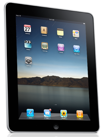
I don’t know if it’s just me, but the picture of the iPad that Apple used on its site doesn’t seem like a good one. I think it’s probably a meteor shower or something, but subconsciously I guess the image looks a lot like scratches. My first reaction was,”Man that thing looks like it would get scratched all to heck.” Of course they’ll make screen protectors, but I HATE using screen protectors.
Anyway check out the picture and see what you think. Or, look at the original image here iPad.
Technology posts:
Sleep Cycle Alarm Clock App Could be Life-Changing

One response to “Bad Picture Choice for the iPad?”
Oh my! Somebody wasn’t thinking carefully somewhere in the design of that giant phone/laptop thing.